Too many folks think every patch of wall in a living room needs something—pictures, shelves, plants, whatever. But have you ever walked into a place where the walls feel 'busy' and your eyes don’t know where to land? That’s when you realize: blank space isn’t a decorating sin.
Leaving some walls empty actually helps your favorite art or shelves stand out. It can make the entire room feel calmer and bigger, without looking unfinished. Plus, a bare wall gives your eyes a place to rest. If you’re feeling stuck, take a step back and ask, “If I add something here, does it help or clutter the room?” That one question saves a lot of headaches down the road.
- The Myth of the Decorated Wall
- When Blank Walls Are Better
- Finding the Right Balance
- Picking Art That Works For You
- Common Mistakes People Make
- Easy Tips for a Room That Feels Right
The Myth of the Decorated Wall
There's an old idea floating around that for a living room to look “finished,” every wall needs something on it. This belief probably comes from model homes and magazine shoots, where designers pile on wall art and decorations for dramatic photos. But here’s the twist: most pros don’t actually live with all four walls loaded up. They style things heavy for the camera, then scale it back for real life.
Turns out, too much stuff on your walls can quickly make your living room feel smaller and maybe even a bit cluttered. According to a 2023 survey by the American Home Decor Association, about 68% of homeowners said a crowded room made them less likely to relax. What’s really wild? In the same survey, people ranked one or two strong living room design pieces as “more welcoming” than walls jam-packed with pictures and frames.
Let’s break a common myth: blank space isn’t wasted. It actually gives your eye a break and helps your favorite pieces pop. That’s why some of the coolest rooms in design magazines have only one wall of art and plenty of open space elsewhere.
Here's what the experts say adds visual stress in a living room:
- Decorating all available wall space
- Hanging mismatched frames or art just to fill a gap
- Layering too many types of wall art without a plan
The takeaway: you don’t have to fill every wall. Sometimes, less is just better for your home and your head.
When Blank Walls Are Better
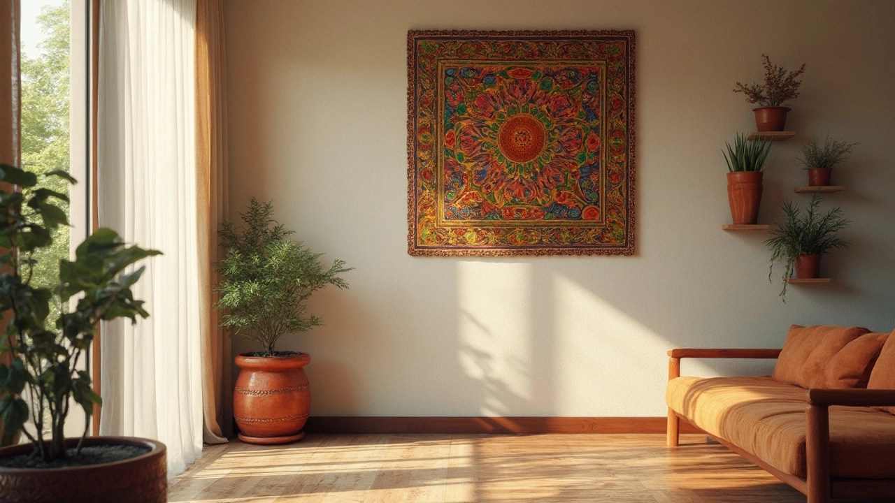
Sometimes, leaving a wall empty in your living room just makes sense. Not every space needs to grab attention. In fact, professional interior designers often use blank walls to keep the vibe chill and help a room breathe. It’s like giving your eyes a break from all the action. If you’ve got a standout piece of wall art or furniture, a blank wall nearby lets those features shine even more.
Ever notice how art galleries rarely crowd every inch? There’s a reason. Too much stuff starts to feel like clutter, not style. According to Nate Berkus, design expert and NY Times bestselling author:
"Negative space is just as important as what you bring into a room. Sometimes the best thing you can do for your space is to leave a wall blank."
Blank walls work especially well if:
- Your living room is on the small side. Empty walls create the illusion of space and help natural light bounce around.
- You’re into a minimalist style and prefer a simple, purpose-driven look that’s easier on the mind.
- You want to draw focus to a specific area, like a fireplace or a gallery wall.
- You love the materials or paint color on your walls (think exposed brick, cool wallpaper, or a favorite hue).
According to a 2023 survey by the American Society of Interior Designers, over 60% of pros said they often leave at least one wall empty when designing a living room. It’s not about laziness—it’s about balance.
Bottom line: Sometimes less is actually more. Trust your gut. If a wall feels done, even without anything on it, you’re probably right.
Finding the Right Balance
There's a sweet spot between bare walls and a room that feels like an art gallery exploded. Designers say balance is key in living room design. You want your eye to travel around the space without getting stuck or overwhelmed.
A good rule of thumb: for every two filled walls, leave one empty. This isn’t a strict math thing—it’s more about giving your space some breathing room, literally.
"Every wall doesn’t need to be a highlight. Treat empty walls as part of the overall design, not a decorating failure."
— Emily Henderson, interior stylist
Arrange your wall art so there's a visual flow. For example, if you have a bold gallery wall, let the opposite wall sit blank or just have a simple sconce or mirror. That way, your art doesn’t fight for attention.
Don’t forget to factor in furniture. Sometimes a large couch or tall bookshelf acts as wall art on its own. When planning, draw a quick map (even a stick figure sketch works) to spot where clutter might form. If two crowded walls are next to each other, swap something out and leave one open.
- Keep statement art opposite windows for natural light.
- Balance large, loud art with calm spaces—think a big painting and a blank wall across.
- Use smaller pieces in groups, but avoid covering every inch.
If you're the data type, a 2023 survey by Houzz showed that 57% of people prefer at least one open wall for a calmer vibe in common spaces.
| Wall Treatment | Preferred by Homeowners |
|---|---|
| Every wall fully decorated | 18% |
| Mix of art & blank walls | 57% |
| Mostly blank walls | 25% |
The magic really happens when the decorating tips you choose fit your personality, not some rulebook. Step back, look around, and trust your gut until the room just feels right to you.
Picking Art That Works For You
There’s no secret formula for picking the right wall art for your living room. It mostly comes down to what makes you smile when you walk by. But if you want that put-together look, a few simple tricks help narrow things down. The most important tip? Pick art that feels personal. Art isn’t just about matching your couch—if you like it, it works. Simple as that.
Next, think about the size of your wall. Hanging something tiny all by itself on a big, empty wall usually makes things feel unfinished. On the other hand, having giant art on a small wall can swallow up the space. The sweet spot is usually an artwork that takes up two-thirds to three-quarters of the width of your furniture—like the couch or console table below it. That’s a tip straight out of basic home design books.
Color is another thing to keep in mind. If your living room is mostly neutral, a pop of color in your wall art can wake things up without too much commitment. On the flip side, if you already have lots going on with pillows or rugs, black-and-white art or softer tones can calm things down.
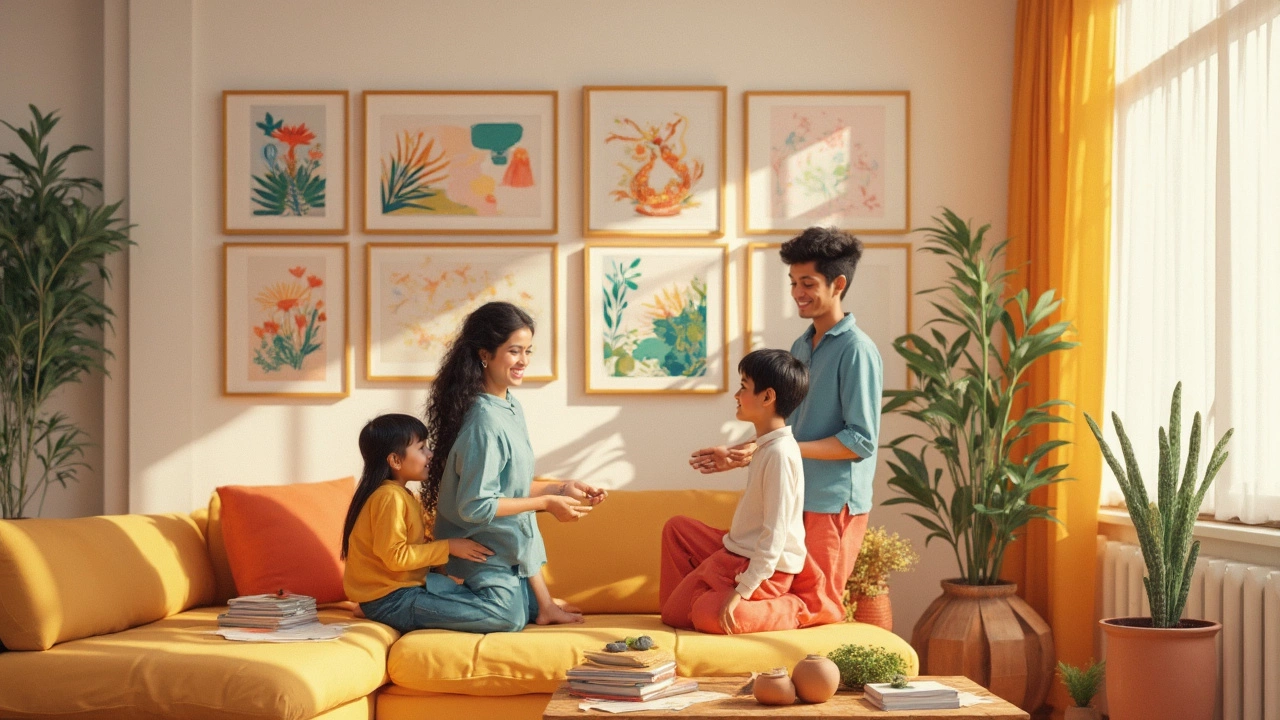
If you can’t pick just one piece, a gallery wall’s always fun. Mix and match different sizes, colors, or even types—photos, prints, canvas, maybe something odd like a skateboard deck. Just keep the spacing even. Speaking of which, here’s something you might not know: Most museums hang art so the center sits at about 57 inches from the floor, which is eye level for most people. Try that in your living room for a pro touch.
- Start with one piece you love, then build around it.
- Use tape or paper cutouts to test layouts before you hang anything.
- If you move a lot or get bored fast, framed posters or art prints are cheaper to swap out.
- Don’t feel tied to just framed art – textiles, baskets, or metal sculptures can count as wall art too.
Finding art that works for you is about enjoying what you see—and making your living room feel like you. No pressure to impress anyone but yourself.
Common Mistakes People Make
When it comes to wall art in the living room, it’s easy to get tripped up. One of the biggest goofs? Filling every single wall just because you think you should. It’s super tempting, especially if you have a pile of prints or photos begging for a spot. But you don’t need to turn your living room into a mini gallery.
Another mistake is hanging art too high or too low. Designers often say that art should hit at eye level, which for most people means around 57 to 60 inches from the floor to the center of the piece. Go much higher and your guests will strain their necks; too low and it just looks weird.
Folks also tend to hang stuff that’s way too small for the wall. Picture a tiny 8x10 frame floating in the middle of a big blank space—that just makes the wall look even emptier. Either go bigger with your decorating or group smaller pieces together.
Another classic slip: not paying attention to balance. If you crowd all your wall decor onto one side of the room, everything feels off-kilter. Spread things out so the space feels even. And don’t forget about matching styles. If you’re into modern home decor, try keeping your colors and frames in a similar vibe instead of mixing eight different styles that clash.
- Putting art on every wall (it’s okay to leave some blank!)
- Incorrect height when hanging art
- Choosing art that’s too small for the wall space
- Ignoring the balance of the whole room
- Mixing styles that don’t gel together
According to a 2023 survey from Houzz, 43% of people said their biggest decorating regret was overcrowding their walls the first time around. That’s a huge number—and a good reason to take your time and get it right.
Easy Tips for a Room That Feels Right
Let’s cut through the noise. If you want a living room that feels natural and put together, you need a plan more than a shopping spree. Here’s how to make your space work, without covering every bit of your walls.
- Step back before you start. Seriously, don’t buy a single piece of wall art before you look at the whole room. Where does your eye go first? Leave those spots open, or save them for your very best piece.
- Pick a focus wall. Most living rooms have a main wall that just makes sense for art—usually behind your sofa or above the entertainment unit. One strong piece or an arranged gallery here looks intentional, not crowded.
- Mix it up—with balance in mind. If you do hang art or home decor on more than one wall, don’t put the same kind of thing everywhere. Mix photos, shelves, mirrors, or even just paint. Keep at least one wall empty for that airier feel. Most interior designers say leaving 30-40% of wall space blank actually makes the art you do hang look better.
- Size matters. Large spaces can easily handle big statement pieces, but if your living room is small, oversized art or too many items makes the room feel squished. Try to have your art fill about 60% of the wall’s width, especially above furniture, for the best look.
- Stay true to your style. Just because it’s trending doesn’t mean it belongs in your home. If clean and simple feels right, go for it. If you like a lively vibe, add brighter or bigger pieces—but always check with your gut rather than a magazine.
A national home design survey from 2023 found that when people left at least one wall empty, 8 out of 10 said their space felt more relaxing. There’s something to that—your eyes need a break, and so does your mood.
The bottom line? Less can really be more with living room design. Let your best stuff do the talking, and give everything else around it a little breathing room. Try these steps, and your living room won’t just look good—it’ll actually feel good to be in.