Color Tips – Your Guide to Paint, Light & Style
When working with Color Tips, practical guidance on picking and applying colors in home interiors. Also known as colour advice, it helps you create rooms that feel right and look great. Paint Color, the hue you spread on walls and ceilings is the first building block, while Interior Design, the overall plan that blends furniture, textures and accessories gives those hues purpose. Finally, Lighting, the type and placement of light sources in a space changes how colors appear at different times of day. Together they form a simple formula: Color Tips → Paint + Design + Light. This trio shapes mood, influences perception, and makes even a modest budget feel luxurious.
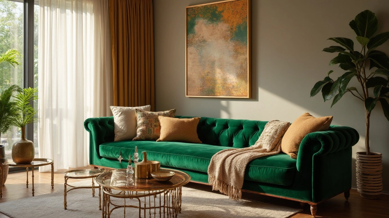
Why does this matter? A wall painted a cool gray can feel spacious under bright daylight but turn chilly after sunset if the room lacks warm light. Color Tips teach you to match pigments with the right fixtures, whether you prefer recessed LEDs, vintage pendant lamps, or natural daylight. The posts below show real‑world examples: a bohemian bathroom that uses bold patterns and plants to soften dark tiles, a 2/3 rule guide for couch and rug sizing that highlights how a muted rug lets a pop‑color sofa shine, and easy bedroom makeover ideas that rely on a single accent wall to create depth without breaking the bank.
How Color Works With Furniture and Layout
Furniture placement isn’t just about function; it also directs the eye toward color focal points. The “corner sofa” guide explains how a neutral‑toned couch can be a perfect canvas for a bright throw or a striking piece of art. Meanwhile, the coffee‑table placement article shows that a glass table under a vibrant rug amplifies the rug’s hue, making the whole room feel cohesive. When you pair these layout tricks with the right paint shade, the space gains balance—no room looks over‑ or under‑styled.
Lighting strategies differ room by room, and that’s intentional. A bright kitchen benefits from cool white lights that keep whites crisp, while a cozy bedroom thrives under warm amber bulbs that enhance soft blues or pastel pinks. The lighting consistency post dives into when you should keep the same temperature throughout the house and when you should create distinct atmospheres. By aligning light temperature with paint color, you avoid the common pitfall of colors looking washed out or too saturated.
All of these ideas share a common thread: they turn abstract color theory into hands‑on actions you can start today. Whether you’re swapping out a sofa cushion, repainting a bathroom, or simply adding a new lamp, the right color tip can make the difference between “just okay” and “wow”. Below you’ll find a curated collection of articles that break each concept down even further, giving you step‑by‑step guides, quick math tricks and visual examples to help you apply what you’ve learned right away.